histogram

What is a histogram?
A histogram is a type of chart that shows the frequency distribution of data points across a continuous range of numerical values. The values are grouped into bin or buckets that are arranged in consecutive order along the horizontal x-axis at the bottom of the chart. Each bin is represented by a vertical bar that sits on the x-axis and extends upward to indicate the number of data points within that bin.
The bins provide a simple structure for mapping the distribution of data points across the range of values. A data point in this sense is simply one of the values within the overall range. This range -- sometimes referred to as the independent variable -- might include people's ages, tree heights, exam scores, animal weights, stock prices or any number of other value types. The data points are plotted along the vertical y-axis and are referred to as the data's frequency, which is in reference to the frequency distribution of the data.
An example of a histogram
Figure 1 shows a histogram of test scores for 200 students. The scores are grouped into six consecutive bins, with each bin represented by a vertical bar of a different color. A histogram's bins can be evenly distributed or adjusted to accommodate specific scenarios, such as the existence of outliers. In this example, the first bin includes test scores from 0 to 50, while the remaining bins are evenly distributed in groups of 10. The second bin contains test scores greater than 50 and up to and including 60, the third bin contains test scores greater than 60 and up to and including 70, and so on.
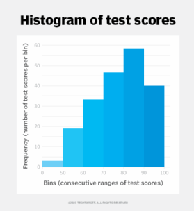
The data points in this case are the students' test scores. The height of each bin, as measured on the y-axes, indicates the number of students whose test scores fall within that bin's range. For example, the histogram indicates that 40 of the 200 students received test scores greater than 90, with 100 being the highest score they could achieve. On the other hand, three students received scores of 50 or below, and 47 students received scores greater than 70 but lower than or equal to 80.
In this histogram, the frequency is the number of student test scores per bin; however, frequency can refer to any values that are being measured, such as the ages, weights or heights of a group of Labrador retrievers. In some cases, a histogram is presented with the independent variable along the y-axis and the frequency of the data points along the x-axis, but this format is much less common. Typically, the independent variable is plotted along the x-axis.
How are histograms used?
Histograms are often used in statistics to visualize the shape of data distribution across a range of values. For example, the histogram above can help analysts learn about the effectiveness of the class, instructor or even the exam itself. They might compare these results with those of other classes, either conducted by the same instructor at different times or conducted by other instructors offering the same class and exam. From these comparisons, analysts might be able to pinpoint where potential issues exist or at least have a starting point for digging deeper into the data.
Analysts often use the physical shape of a histogram's bar pattern to gain quick insights into a data set, but this is effective only when taking into account the context in which the data is generated. For example, Figure 2 shows three histogram patterns: symmetric, right-skewed and left-skewed.
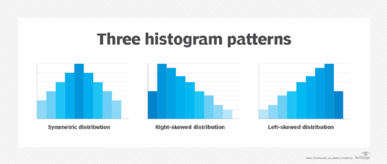
Someone analyzing the test score histogram from above might expect a left-skewed pattern, indicating that the bulk of the students achieved a higher medium score. If the distribution were right-skewed or symmetric, it could indicate an issue with the exam, the class, the instructor or something else. Histograms can produce other patterns as well, each one meaningful within the context of the data.
A histogram is similar in appearance to a bar chart, but the two differ in important ways. The histogram provides a mechanism for visualizing the data points within a continuous range of numeric values -- as seen in the test scores example above. In this case, the data points are distributed across the range of test scores, which are separated into bins.
In contrast, a bar chart compares data categories based on a set of numeric measures. For example, a retail company might use a bar chart to show the number of sales in each product category over the past year, or a medical center might create a bar chart that provides a visual overview of the number of patients receiving different types of treatments over a five-year period.
See the differences among statistical mean, median, mode and range, and check out eight steps to improve data visualization literacy.