
WavebreakmediaMicro - Fotolia
How to test mobile responsive design applications
Two experts offer 10 tips for testing mobile responsive design applications, with or without software requirements.
As proud as we are of an article we wrote five years ago about handling flaws in Web-based applications, the landscape has shifted. Responsive design applications -- a way to make Web pages fit any form factor -- have taken over, bandwidth has increased and Web services are increasingly popular.
There are plenty of articles on mobile application testing; this one focuses on new risks that emerge with mobile responsive design applications that are designed to resize themselves and work on any browser at any reasonable size. That's a bold claim, and someone has to test it.
If that person is you, take heart. This article is for you, too.
1. Test major form factors and browsers
Today's customers use not only the iPhone and laptop, they use a 27-inch display on the iMac, a 10-inch Kindle and a host of tablet devices. These devices can use different browsers, and each form factor and browser combination can render pages differently. And this can change from version to version.
The good news is that browsers are free. If you are on a Windows platform, it is no big deal to install the major browsers -- Internet Explorer, Chrome, Firefox -- and then use a free tool like Browsershots, or a paid one like CrossBrowserTesting, to see what the Web page would look like in Safari. If you are on a Mac, you can have everything but Internet Explorer (IE) -- but you can get most versions of IE easily with the IE-specific virtual machines from Modern.ie.
At this point, the "testing" effort is to look at the pages to see if they render properly, explore the options to see if any dynamic content fails to load or looks awkward, and exercise the happy path. If it is a mortgage application, try to file a mortgage. If it is a word processor, try to create a document -- and explore the user interface as you go.
We also mentioned platform. Find out who the primary users of the software will be. For internal software, the answer is probably users of laptops, phones (Android and iOS) and perhaps tablets. We suggest purchasing one of each major type; compared to the cost of the development, this amount will be very small. While the testing team waits for dedicated mobile devices, the development team likely will be willing to share their phones and tablets.
Finally, consider if you need to support old browsers, perhaps for corporate clients, and walk through the happy path in those devices.
During the course of this work you may find usability problems, where the first image to display doesn't make sense or the page "feels" odd. Share that with the team. It might not be a bug ... but it might be.
2. Resize the browser
Boiled to its essence "responsive content" should look "right" at any reasonable device size, from a 300x300 phone to a 2550x1600 pixel display. The quick and dirty way to assess responsiveness is to resize the browser (a lot) and look at the screen.
There is no setup time required for this type of testing. Just go to the Web page, click the bottom-right corner of the browser and drag it to sizes and dimensions. Is your text where you think it should be and is it still readable? Did your images scale reasonably? Are the controls on your page -- buttons, text fields, date pickers and whatnot -- still usable? Are they covering anything important?
One danger here is that you discover a bug, maybe even a hard-to-reproduce bug, and your product manager tells you that "No one is going to rapidly resize their browser and drag it all around their monitor, and if they do they shouldn't." You may have discovered a class of bugs that you can't report persuasively enough to get fixed. Remember: Somewhere out there is a tablet that has that screen resolution.
Modern versions of IE and Chrome have a tool that helps you adjust the browser size to approximate sizes you may care about, like mobile phones or tablets. If you find a hard-to-reproduce bug by changing the browser size quickly, and you can reproduce it with some of these more common sizes, then you might have a better argument.
3. Mobile devices and rotation
Mobile devices are probably the biggest reason responsive Web design became important. Mobile devices also introduced a new element to responsiveness: rotation. These small devices go everywhere their owner goes. The devices are also rotated freely from portrait to landscape view and back again. At first glance, this seems very similar to resizing. The reality is that each time the device is rotated, the Web page has to be rendered again.
Some apps even change behavior when resized -- the calculator on iOS7, for example, hides scientific notes in portrait mode on the iPhone 4. Ask if this is intuitive, if it makes sense and then check if it is working properly.
4. Responsiveness checkers
A whole slew of responsiveness checkers are available on the Web. Some of these are simple and give you a view of what your page will look like at different browser sizes. More complicated options, like BrowserStack, simulate a number of possible display sizes combined with the ability to switch between landscape and portrait mode. That configurability mixed with the ability to interact with the simulated sizes can create a powerful responsive test environment.
Here's a simple picture from ami.responsivedesign.is, which takes a URL to a real Web page and renders it on five different devices (Figure 1). The ami.responsivedesign.is page does not render that as a static image; the scrollbars on the pictures actually work to scroll up and down.

5. Soap opera tests
Hans Buwalda writes about soap opera tests, a testing style that encourages extreme scenarios. These extreme scenarios test multiple conditions at the same time -- and if they work, tell you a great deal. (If they do not, you'll likely need to do some debugging to figure out what condition failed.) For mobile responsive design applications, this means changing the browser quickly, switching between tabs continuously and so on. If you are testing rotation, rather than rotating and waiting for the page to finish rendering, keep rotating the device like a toddler pretending to drive with a toy steering wheel.
Once you have found a possible problem with these extreme scenarios, you can reel them in little by little until you get a more realistic scenario.
You also can run soap opera tests on the functionality, testing a mortgage that is one year at 99% interest with annual payments with 0% down, then flipping the script to test a mortgage that is 90 years with 99% (or -5%) interest with daily payments and so on. Think of moving the slider for the dials all the way, but the input should be legitimate, not invalid. For insurance claims this means processing a claim the day before (and one the day after) it became too old to process, for a date one day before the coverage expired (and one day after), for a child that turned 27 and would age out of insurance the day before (and after) and so on. If the claims pay properly and the mortgage numbers are correct, you've covered a fair amount of functionality fairly quickly.
6. Mobile from a link experience
It is not a secret that technology has shifted to have a massive focus on mobility. Most people have a mobile phone that can access the Web, slightly fewer people have some sort of Web-enabled tablet. So what happens when you are scrolling through your Facebook feed and click a link to a tweet? Does it open in a browser or the Web? Do you have to log in and get redirected if you are already authenticated through the app?
Consider the smartphone user who clicks on a link from Facebook that goes to a website that requires a login. The user does not know his password and gets it wrong the first time, switches to email, looks up the username and password, and gets it wrong the second time. Is the user redirected to the correct page or sent to the home page? Is the "home" page the user sent to mobile? This is a sort of soap opera test for mobile from a link.
These questions are designed to help you find out if your Web page will respond in a reasonable way when moving from a regular Web link, to a mobile device that may or may not have an app to handle that behavior. There are a lot of scenarios to consider.
7. Desktop to mobile translation
After you click that link on your mobile device, you can check how well things translate. Some functions that are common and easy, even intuitive on a full-size computer, like right-click and on hover events -- don't make any sense on phones and tablets. Other controls, like buttons and text fields for example, are common across formats but need some special usability considerations. Buttons can quickly become too small to click and text fields may need to handle different usages of the return button. Should it submit? Should it insert a new line? You'll have to decide for yourself.
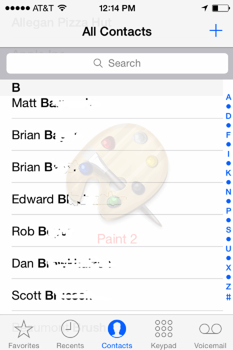
Another mobile concern is very small links, such as the first letter in the contact list on the right side in Figure 2. Make sure a human can click the link on a real device, because simulators driven by a mouse often have more precision that real fingers do.
8. Website performance
Creating a Web app that responds to all manner of different platforms and screen sizes can have side effects. If your website can adjust to different form factors, there is still the question of whether things can perform at a reasonable speed. It usually won't take much to discover performance problems introduced from responsive design changes; a couple of devices and a couple of browsers can find timing issues and memory leaks where the server is stepping on itself.
On the client side, use tools like yslow to see if the rendering is reasonably fast on the most popular devices -- and what to do about it.
9. Common bugs
New form factors, screen resolution and this magic ability to resize based on the screen resolution has created entirely new categories of bugs. Some of the more common bugs we have seen involve subtle changes in image scaling after a resize so the image looks just a little bit off. We've also seen cases where text, images and controls are all layered on top of each other, some even hanging off the edge of the page after changing browser dimensions. Some applications create a scrollbar in JavaScript and the browser may attempt to create its own, making two scrollbars -- one native, one created by the application programmer.
For the most part, testing the specific responsive design bits of an application isn't all that difficult. You have a few key ideas to remember, and a combination of platforms, browsers and devices to choose from. Once you have that figured out this becomes an exercise in test selection.
10. Beyond responsive quick attacks
Once you've done quick attacks, the team probably has some serious bugs to work through, while the people doing the testing now have a much better understanding of how the software works. From here you have a few ideas. If it makes sense, you might draw or at least consider the various stage transitions in the application. A trivial but helpful example of this is login page, error page and homepage. Look for paths that are unusual and exercise those. At the same time, learn about the customer and the key scenarios it needs to accomplish to do the job and go through those -- in the riskiest, most failure-prone form factors.
Then have conversations with the whole team about the strange conditions that are possible. Look for people who give you different answers about what the software should do under those conditions -- because there will be bugs hiding there. From there you are on to traditional mobile device testing, security, usability and other risks to the customer. Keep moving outward in expanding circles until it is time to ship; then you get to start the game all over again.
Too much to test? Not enough time? A combination of devices and browsers got you down? It'll be okay. Start again at number one -- and don't forget to enjoy the game.